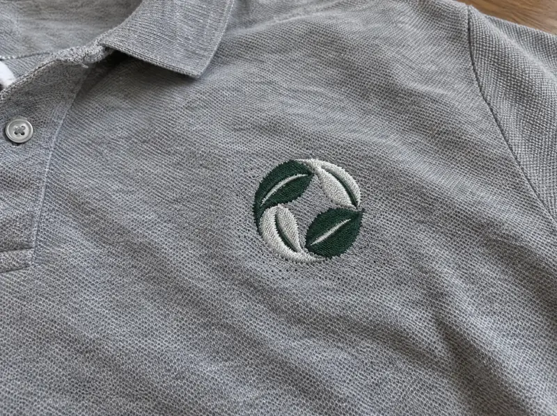
Most logos are designed for letterheads and websites, then asked to work at three inches on a polo. Scale the artwork down and the problems arrive together: counters in letters like "e" and "a" close up, hairline strokes disappear, and a tagline turns into a line of thread.
A left chest build fixes that at the source. Letters are spaced wider, strokes are thickened to a stitchable weight, and fine detail that can't survive is simplified with your approval. The result looks like your logo at arm's length, which is how people see it.
If you need the logo at other sizes too, each is its own build; the logo digitizing page covers other placements, and small lettering and sleeve digitizing covers names and sleeve text.
We'll tell you before we start if part of the logo won't read at chest size, and suggest the fix: a bolder weight, a larger size, or moving a tagline to the sleeve or back.